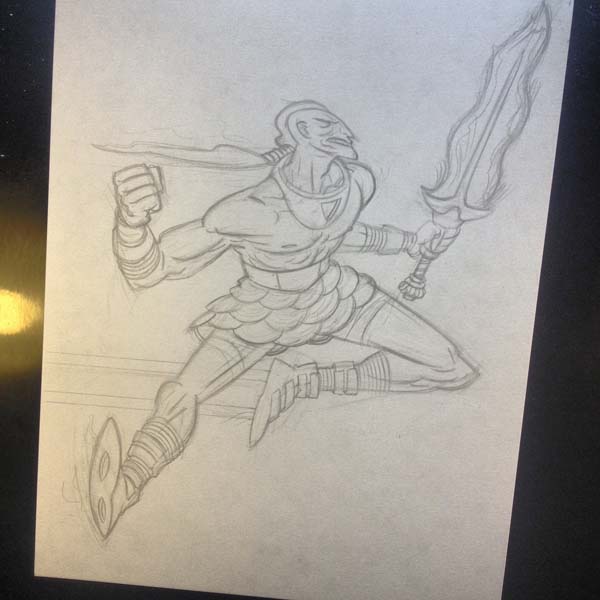
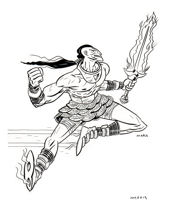
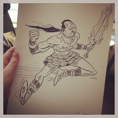
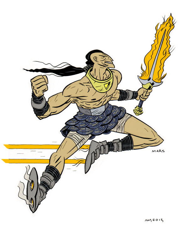
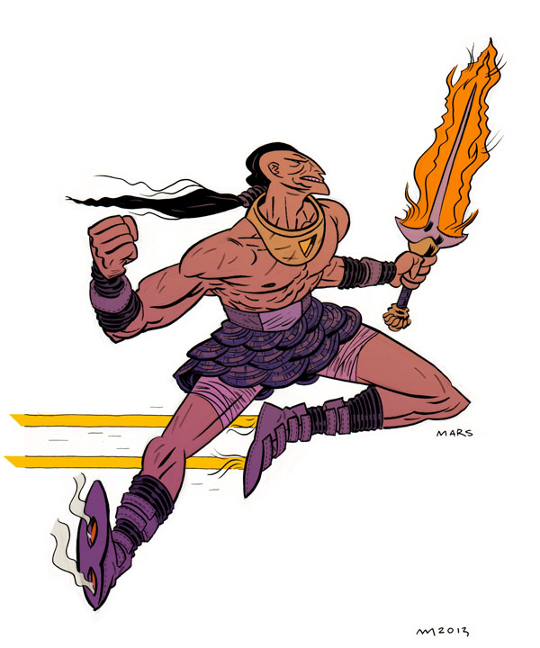
After a bunch of discussion about the pros and cons of Mr. Andrew MacLean’s first design, he took another stab and, fortuitously and amazingly (and maybe because he’s a rad character designer and, possibly, a mind reader), got us all the way there. It looks like there’s no such thing as talking too much in character design!
Here’re my initial reactions…
Wow, dude… I love so damn much about this! The boots are AMAZING! I LOVE the sword and I think that bubble helmet-producing collar looks great!
I’m all about the full on skirt, but I like that between these two illustrations, you’ve already given him costume changes. I think we can find uses for both these looks.
The only thing that I think this design has working against it is that it feels less nautically inspired. It looks great and is very barbarian, but doesn’t have the same ocean flair as the last one.
That said… costume changes! So we don’t always have to see that.
Are those wristbands?
And while there was a lot of talk about possible distinguishing birthmarks and a bunch more discussion about the helmet before this version came to life, the second take from Andrew became the final design for Mars.
Then it was off to Mr. Ryan Hill.
Here was my initial guidance/notes for Ryan…
Bright, nautical-themed colors. Turquoises, salmon, bright blue, yellows… Did you know that ancient greek ruins as we see them today, stark and white, used to be painted in bright gaudy colors? That is kind of the idea here. Use that kind of palette, which may not look ancient to most people, but it actually will be… plus, it will look futuristic and sci-fi-like, so… wham, bam!
That make sense?
Mars should probably have an olive colored skin, as the book’s world uses space as a metaphor for the Mediterranean, he should probably look that way.
And his first stab…
…which was a bit too alien. Which reminded me: Take nothing for granted when you send someone something to work on. Ryan’s a good buddy who I’d explained Mars to a bunch. And yet, I forgot to mention this guy flying around space was human. Olive skin on an alien versus olive skin on a human, yeah… not necessarily the same note. Live and learn!
My response way back then…
First and foremost, this looks cool as hell, man! Regardless of the fact some things are not what I was picturing, this looks really cool!
I should have maybe specified this more, but Mars is human and should have olive skin (think Mediterranean: Greeks and Romans).
I like the sword a lot! And like the salmony color used on the skirt and boots… The orange might be a bit much, but mostly ’cause it detracts from the orange of the boot flames…
Once the olive skin tone is taken care of, maybe see if you can find a greener or turquoise type color that works in place of all the orange on Mars? Or maybe orange will look great after that…
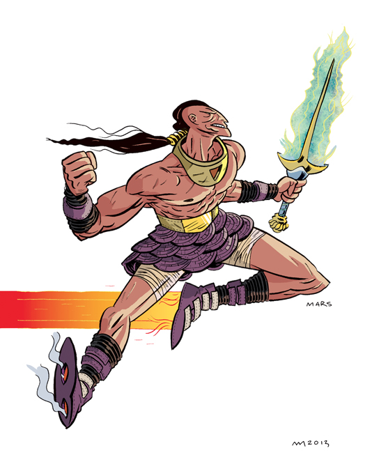
Then Andrew, who wanted a little less neon, did a few takes to give it a more subdued coloring. Flat colors and one with a gradient…
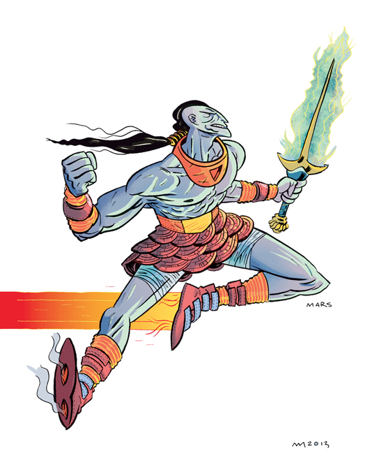
Ryan took these, worked his magic, and did what he described as a combo of Andrew’s two takes with some touches he wanted to retain rendering-wise and we were nearly there. Gaudy and mediterranean without being too neon or over the top.
A bit of fine tuning on some minor details and we were there!
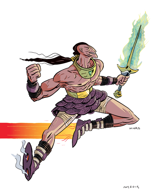
And so, a hero was BORN!
